Apple’s design language is evolving — and in iOS 26, the company is bridging spatial UI principles from visionOS into the iPhone. With the release of Liquid Glass and SwiftUI enhancements, developers now need to adopt composable, spatially aware, and depth-enhanced design patterns to remain native on iOS and future-ready for Apple Vision platforms.
This comprehensive post explores more than a dozen core UI concepts from visionOS and how to implement them in iOS 26. You’ll learn practical SwiftUI techniques, discover Apple’s new visual hierarchy rules, and see how these patterns apply to real-world apps.
📌 Why visionOS Matters to iOS Devs
Even if you’re not building for Vision Pro, your app’s design will increasingly reflect visionOS patterns. Apple is unifying UI guidelines so users feel visual and interaction continuity across iPhone, iPad, Mac, and Vision Pro.
Key Reasons to Adopt visionOS UI Patterns:
- Liquid Glass design extends to iPhone and iPad
- Spatial depth and blurs will become standard for modals, sheets, cards
- Accessibility and gaze-ready layouts will soon be mandatory for mixed-reality support
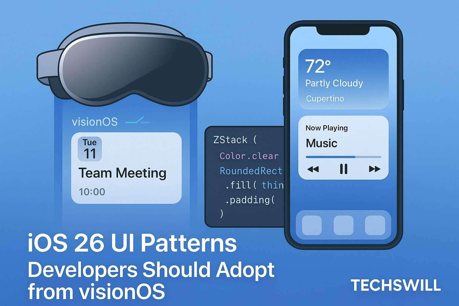
🧊 Glass Panels and Foreground Elevation
visionOS apps organize interfaces using translucent glass layers that float above dynamic content. In iOS 26, this is possible with new Material stacks:
ZStack {
  Color.background
  RoundedRectangle(cornerRadius: 32)
    .fill(.ultraThinMaterial)
    .overlay {
      VStack {
        Text("Welcome Back!")
        Button("Continue") { showNext = true }
      }.padding()
    }
    .shadow(radius: 10)
}
✅ Use .ultraThinMaterial for layered background blur. Combine with shadows and ZStacks to show visual priority.
📐 Responsive UI with Container Awareness
visionOS UIs scale naturally with user distance and screen size. iOS now mirrors this with LayoutReader and GeometryReader for adaptive views:
@Environment(\.horizontalSizeClass) var size

if size == .compact {
  CompactView()
} else {
  GridLayout(columns: 2) {
    ForEach(items) { ItemCard($0) }
  }
}
💡 Combine with presentationDetents to scale modals to device context.
🔄 Spatial Transitions & Matched Geometry
visionOS relies heavily on animated transitions between panels and elements. These behaviors now appear on iOS with matchedGeometryEffect and .scrollTransition.
@Namespace var cardNamespace

CardView()
  .matchedGeometryEffect(id: cardID, in: cardNamespace)
  .transition(.asymmetric(insertion: .opacity, removal: .scale))
🎯 This improves continuity between navigation flows, especially in multi-modal apps.
🧭 Navigation Patterns: Sheets, Cards, Drawers
visionOS avoids deep nav stacks in favor of layered sheets and floating panels. iOS 26 supports:
.sheetwith multiple detents.popoverfor small-card interactions.fullScreenCoverfor spatial transitions
.sheet(isPresented: $showSheet) {
  SettingsPanel()
    .presentationDetents([.fraction(0.5), .large])
}
These transitions match those found on Vision Pro, enabling natural movement between states.
🎨 VisionOS Visual Styles for iOS
Use This → Instead of This:
- Material + Card Border → Flat white background
- Shadowed button on blur → Standard button in stack
- Scroll view fade/expand → Full-page modals
- GeometryReader scaling → Fixed pixel height
These give your iOS app the same depth, bounce, and clarity expected in visionOS.
♿ Accessibility & Input Flexibility
- Label all controls with
accessibilityLabel() - Group elements with
accessibilityElement(children: .combine) - Support voiceover via landmarks and hinting
Design assuming pointer, gaze, tap, and keyboard input types.